I'm an engineer by trade. I rely on intuition when investigating a slow Django app. I've solved a lot of performance issues over the years and the short cuts my brain takes often work. However, intuition can fail. It can fail hard in complex Django apps with many layers (ex: an SQL database, a NoSQL database, ElasticSearch, etc) and many views. There's too much noise.
Instead of relying on an engineer's intuition, what if we approached a performance investigation like a data scientist? In this post, I'll walk through a performance issue as a data scientist, not as an engineer. I'll share time series data from a real performance issue and my Google Colab notebook I used to solve the issue.
The problem part I: too much noise

Photo Credit: pyc Carnoy
Many performance issues are caused by one of the following:
- A slow layer - just one of many layers (the database, app server, etc) is slow and impacting many views in a Django app.
- A slow view - one view is generating slow requests. This has a big impact on the performance profile of the app as a whole.
- A high throughput view - a rarely used view suddenly sees an influx of traffic and triggers a spike in the overall response time of the app.
When investigating a performance issue, I start by looking for correlations. Are any metrics getting worse at the same time? This can be hard: a modest Django app with 10 layers and 150 views has 3,000 unique combinations of time series data sets to compare! If my intuition can't quickly isolate the issue, it's close to impossible to isolate things on my own.
The problem part II: phantom correlations
Determining if two time series data sets are correlated is nortiously fickle. For example, doesn't it look like the number of films Nicolas Cage appears in each year and swimming pool drownings are correlated?

Spurious Correlations is an entire book related to these seemingly clear but unconnected correlations! So, why do trends appear to trigger correlations when looking at a timeseries chart?
Here's an example: five years ago, my area of Colorado experienced a historic flood. It shut off one of the two major routes into Estes Park, the gateway to Rocky Mountain National Park. If you looked at sales receipts across many different types of businesses in Estes Park, you'd see a sharp decline in revenue while the road was closed and an increase in revenue when the road reopened. This doesn't mean that revenue amongst different stores was correlated. The stores were just impacted by a mutual dependency: a closed road!
One of the easiest ways to remove a trend from a time series is to calculate the first difference. To calculate the first difference, you subtract from each point the point that came before it:
y'(t) = y(t) - y(t-1)
That's great, but my visual brain can't re-imagine a time series into its first difference when staring at a chart.
Enter Data Science
We have a data science problem, not a performance problem! We want to identify any highly correlated time series metrics. We want to see past misleading trends. To solve this issue, we'll use the following tools:
- Google Colab, a shared notebook environment
- Common Python data science libraries like Pandas and SciPy
- Performance data collected from Scout, an Application Performance Monitoring (APM) product. Signup for a free trial if you don't have an account yet.
I'll walk through a shared notebook on Google Colab. You can easily save a copy of this notebook, enter your metrics from Scout, and identify the most significant correlations in your Django app.
Step 1: view the app in Scout
I login to Scout and see the following overview chart:

Time spent in SQL queries jumped significantly from 7pm - 9:20pm. Why? This is scary as almost every view touches the database!
Step 2: load layers time series data into Pandas
To start, I want to look for correlations between the layers (ex: SQL, MongoDB, View) and the average response time of the Django app. There are fewer layers (10) than views (150+) so it's a simpler place to start. I'll grab this time series data from Scout and initialize a Pandas Dataframe. I'll leave this data wrangling to the notebook.
After loading the data into a Pandas Dataframe we can plot these layers:

Step 3: layer correlations
Now, lets see if any layers are correlated to the Django app's overall average response time. Before comparing each layer time series to the response time, we want to calculate the first difference of each time series. With Pandas, we can do this very easily via the diff() function:
df.diff()
After calculating the first difference, we can then look for correlations between each time series via thecorr() function. The correlation value ranges from −1 to +1, where ±1 indicates the strongest possible agreement and 0 the strongest possible disagreement.
My notebook generates the following result:

SQL appears to be correlated to the overall response time of the Django app. To be sure, let's determine the Pearson Coefficient p-value. A low value (< 0.05) indicates that the overall response time is highly likely to be correlated to the SQL layer:
df_diff = df.diff().dropna()
p_value = scipy.stats.pearsonr(df_diff.total.values, df_diff[top_layer_correl].values)[1]
print("first order series p-value:", p_value)
The p-value is just 1.1e-54. I'm very confident that slow SQL queries are related to an overall slow Django app. It's always the database, right?
Layers are just one dimension we should evaluate. Another is the response time of the Django views.
Step 4: Rinse+repeat for Django view response times
The overall app response time could increase if a view starts responding slowly. We can see if this is happening by looking for correlations in our view response times versus the overall app response time. We're using the exact same process as we used for layers, just swapping out the layers for time series data from each of our views in the Django app:

After calculating the first difference of each time series, apps/data does appear to be correlated to the overall app response time. With a p-value of just 1.64e-46, apps/data is very likely to be correlated to the overall app response time.
We're almost done extracting the signal from the noise. We should check to see if traffic to any views triggers slow response times.
Step 5: Rinse+repeat for Django view throughputs
A little-used, expensive view could hurt the overall response time of the app if throughput to that view suddenly increases. For example, this could happen if a user writes a script that quickly reloads an expensive view. To determine correlations we'll use the exact same process as before, just swapping in the throughput time series data for each Django view:
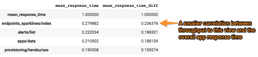
endpoints/sparkline appears to have a small correlation. The p-value is 0.004, which means there is a 4 in 1,000 chance that there is not a correlation between traffic to endpoints/sparkline and the overall app response time. So, it does appear that traffic to the endpoints/sparkline view triggers slower overall app response times, but it is less certain than our other two tests.
Conclusion
Using data science, we've been able to sort through far more time series metrics than we ever could with intuition. We've also been able to make our calculations without misleading trends muddying the waters.
We know that our Django app response times are:
- strongly correlated to the performance of our SQL database.
- strongly correlated to the response time of our
apps/dataview. - correlated to
endpoints/sparklinetraffic. While we're confident in this correlation given the low p-value, it isn't as strong as the previous two correlations.
Now it’s time for the engineer! With these insights in hand, I’d:
- investigate if the database server is being impacted by something outside of the application. For example, if we have just one database server, a backup process could slow down all queries.
- investigate if the composition of the requests to the
apps/dataview has changed. For example, has a customer with lots of data started hitting this view more? Scout's Trace Explorer can help investigate this high-dimensional data. - hold off investigating the performance of
endpoints/sparklineas its correlation to the overall app response time wasn't as strong.
It's important to realize when all of that hard-earned experience doesn't work. My brain simply can't analyze thousands of time series data sets the way our data science tools can. It's OK to reach for another tool.
If you'd like to work through this problem on your own, check out my shared Google Colab notebook I used when investigating this issue. Just import your own data from Scout next time you have a performance issue and let the notebook do the work for you!