Metrics
Overview
The overview page provides an at-a-glance, auto-refreshing view of your app’s performance and resource usage (mean response time by category, 95th percentile response time, throughput, error rate, and more). You can quickly dive into endpoint activity via click-and-drag (or pinch-and-expand with a mobile device) on the overview chart.
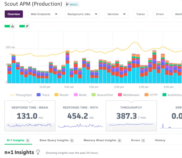
Additionally, you can compare metrics in the overview chart and see how your app’s performance compares to different time periods.
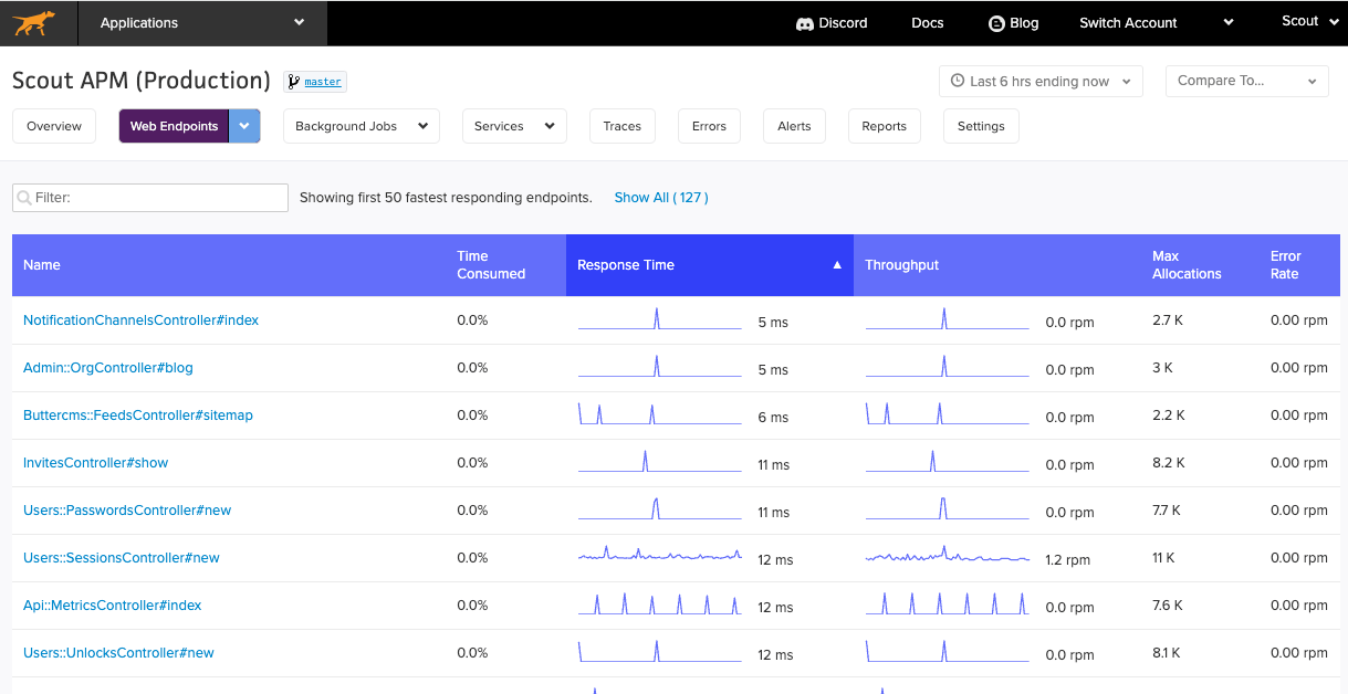
Endpoints
See a list of all your web endpoints and view those that have the highest time consumption, most throughput, allocations, or error rates. Additionally, you can narrow in on specific timeframes and see which endpoints had higher time consumption during overall regressed time periods.
Use the comparison to look for both individual and aggregate trend lines amongst all your endpoints.
Individual Endpoints
You can view metrics for specific controller-action and background job workers. There is a similar chart interaction to the App Performance Overview page, with one difference: your selection will render an updated list of transaction traces that correspond to the selected time period:
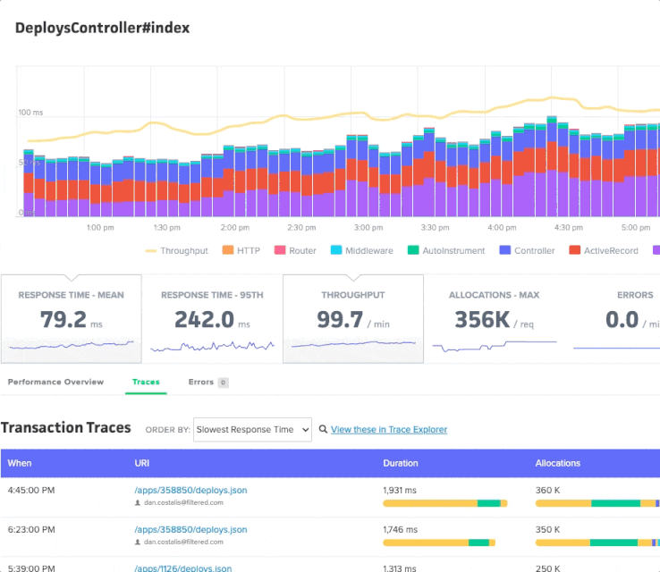
You can sort traces by response time, object allocations, date, and more.
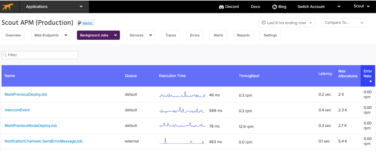
Background Jobs
Similar to web endpoints page, view a list of your background jobs for your application and aggregate metrics such as execution time, throughput, latency, max allocations and error rate.
Database
When the database monitoring feature is enabled, you’ll gain access to both a high-level overview of your database query performance and detailed information on specific queries. Together, these pieces make it easier to get to the source of slow query performance.
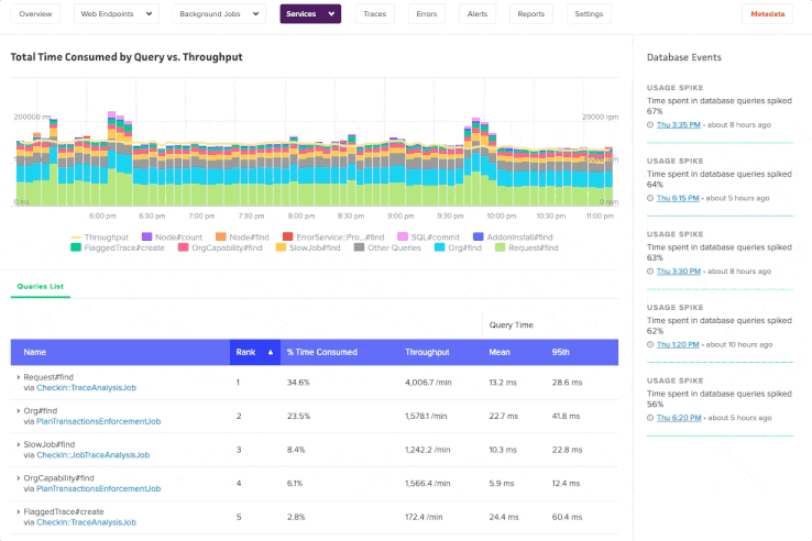
Database Queries Overview
The high-level view helps you identify where to start:
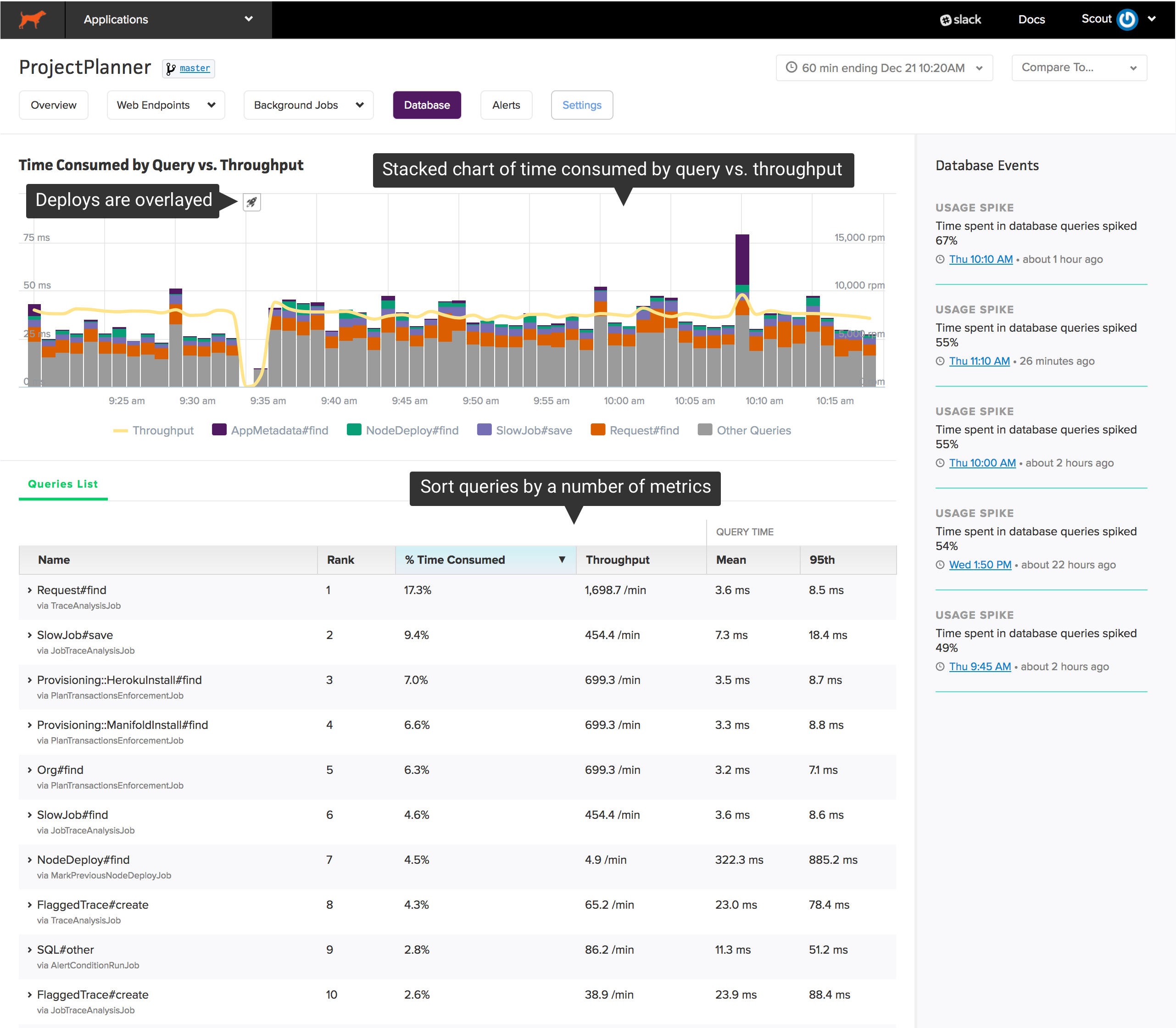
The chart at the top shows your app’s most time-consuming queries over time. Beneath the chart, you’ll find a sortable list of queries grouped by a label (for Rails apps, this is the ActiveRecord model and operation) and the caller (a web endpoint or a background job):
This high-level view is engineered to reduce the investigation time required to:
- identify slow queries: it’s easy for queries to become more inefficient over time as the size of your data grows. Sorting queries by “95th percentile response time” and “mean response time” makes it easy to identify your slowest queries.
- solve capacity issues: an overloaded database can have a dramatic impact on your app’s performance. Sorting the list of queries by “% time consumed” shows you which queries are consuming the most time in your database.
Zooming
If there is a spike in time consumed or throughput, you can easily see what changed during that period. Click and drag over the area of interest on the chart:
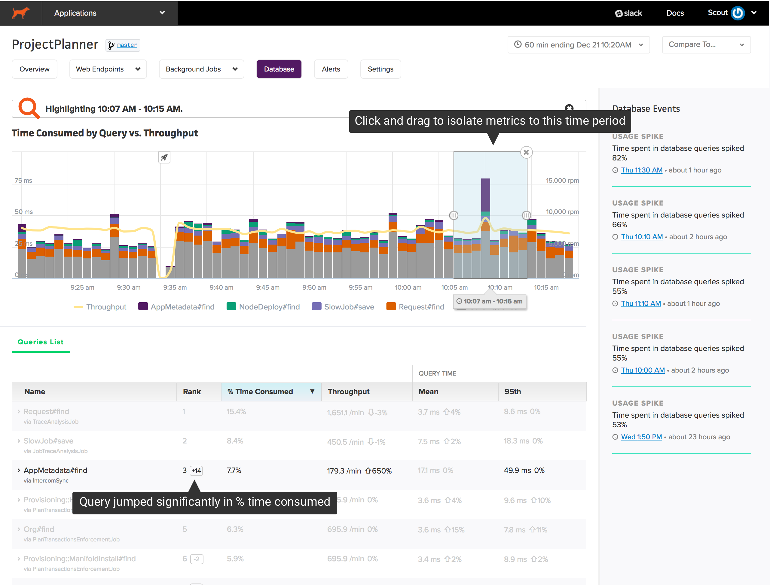
Annotations are added to the queries list when zooming:
- The change in rank, based on % time consumed, of each query. Queries that jump significantly in rank may trigger a dramatic change in database performance.
- The % change across metrics in the zoom window vs. the larger timeframe. If the % change is not significant, the metric is faded.
Database Events
Scout highlights significant events in database performance in the sidebar. For example, if time spent in database queries increases dramatically, you’ll find an insight here. Clicking on an insight jumps to the time window referenced by the insight.
Database Query Details
After identifying an expensive query, you need to see where the query is called and the underlying SQL. Click on a query to reveal details:
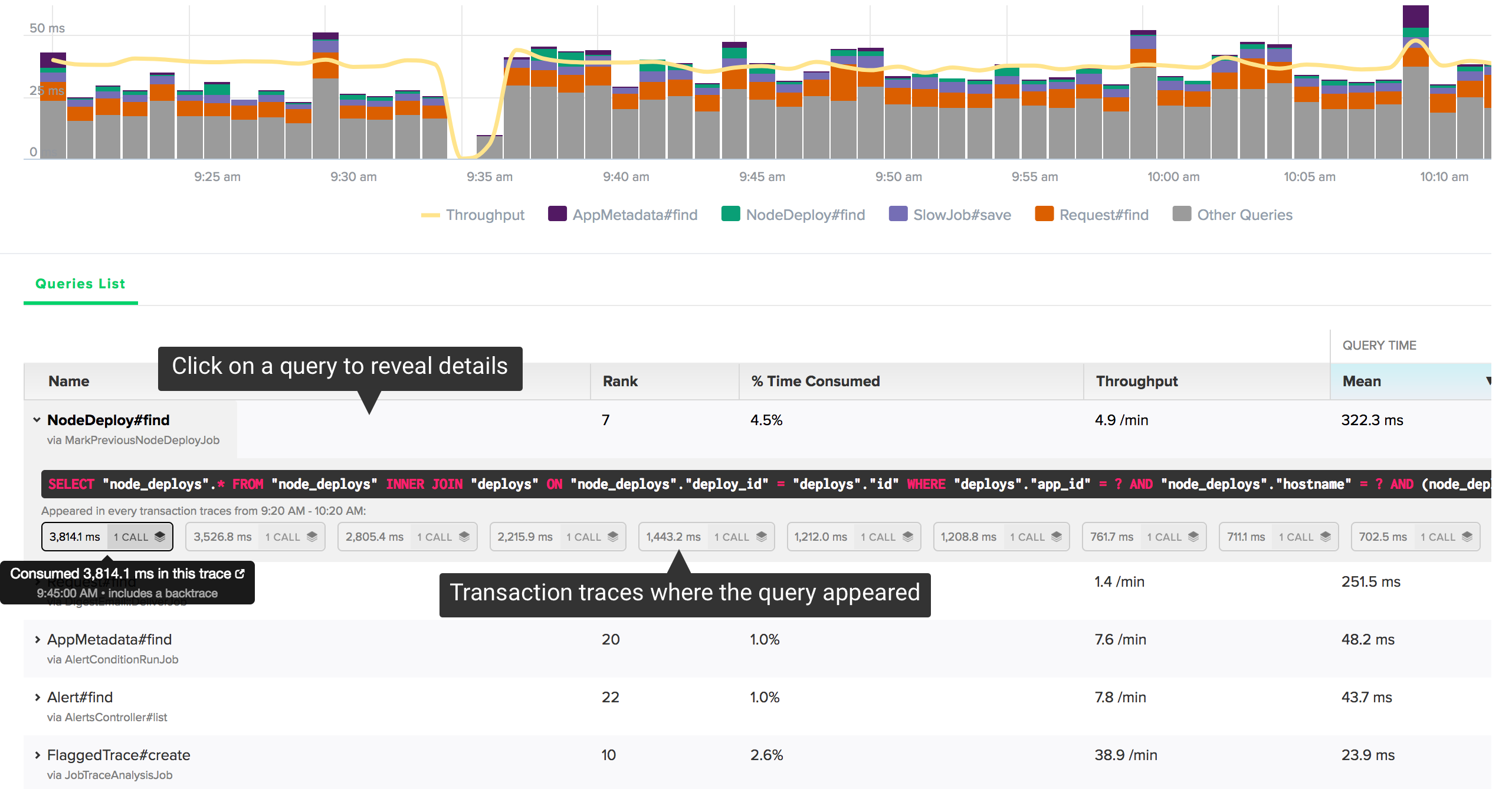
You’ll see the raw SQL and a list of individual query execution times that appeared in transaction traces. Scout collects backtraces on queries consuming more than 500 ms. If we’ve collected a backtrace for the query, you’ll see an icon next to the timing information. Click on one of the traces to reveal that trace in a new window:
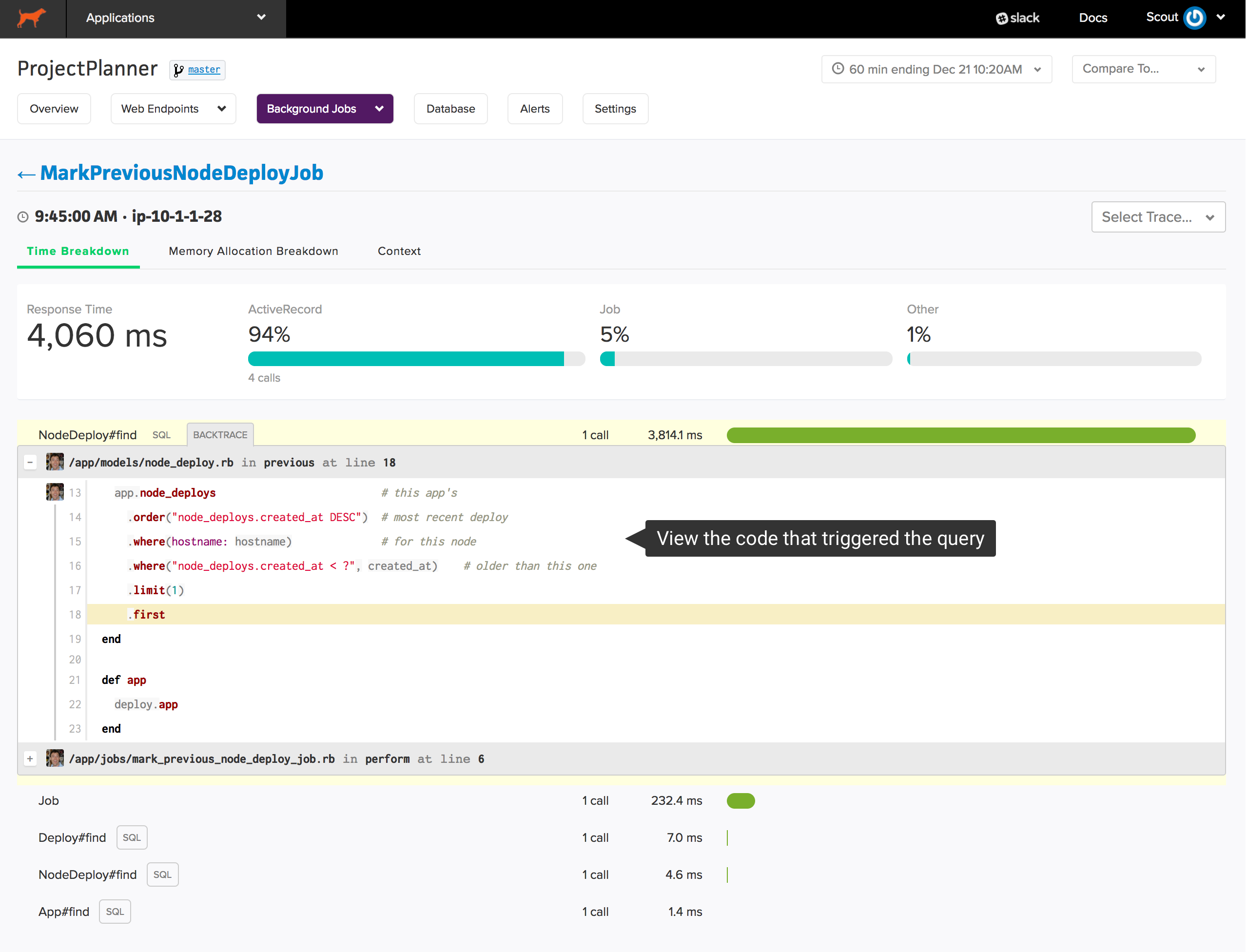
The source of that trace is immediately displayed.
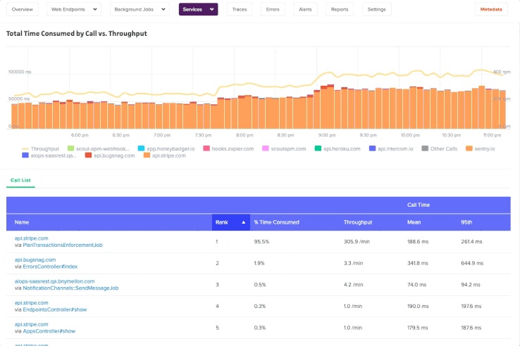
External Services
Gain deeper visibility to further drill down metrics and the time spent into your external API calls with our External Services Dashboard.